This 1200 sq. ft. Flat in proximity to the lush jungles of Aarey is quite literally a house of reflections and narratively a house of serenity and class.
This house embodies subtle colors and neutral tones throughout with different monochromatic palettes in different rooms. This gives each room in this house a feel of individualism while connecting it all in a harmonious flow. As we enter the house, a tan-orange multi-functional shoe rack on the right gives the clients a chance to compartmentalize, organize and declutter, both after entering and before exiting the house.
Walking further ahead, a Grey tinted frame encompassing the corridor entry welcomes us into the living room. Toned-down and neutral colors spread throughout the living room in different forms, materials, surfaces, and textures.
Various spots in the living room consist of reflective surfaces through softly tinted mirrors, glossy marbles, back-painted glass, soft and dulled metals, and modern, chic, and minimal light pieces.
Louvers of different forms are seen throughout the walls adjacent to the TV. To break the monotonous louvers, we divided the walls into several parts and allocated different mediums for different parts. Along with mediums, we have also played with surfaces, directions, and the proximity of lines.
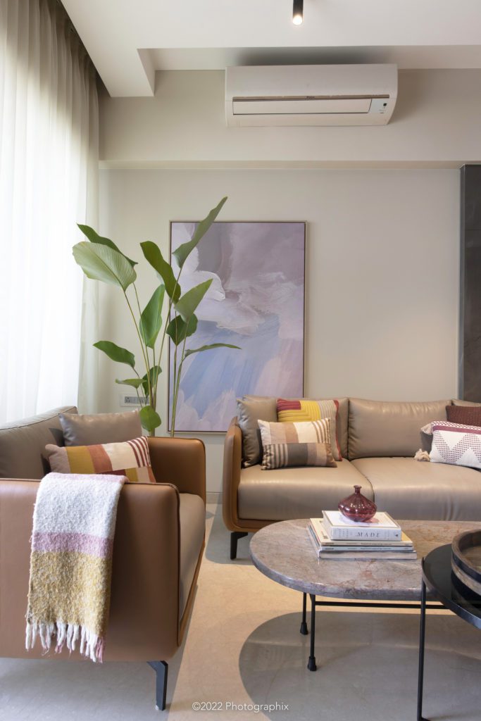
This whole space that connects all the unique rooms of the house is characterized by basic and bold colors, soft forms, and grooved surfaces that work cohesively to form an elegant, cozy, and welcoming space. Let’s not forget the life provided by Studio Jane’s necessity- the oversized planters!!!
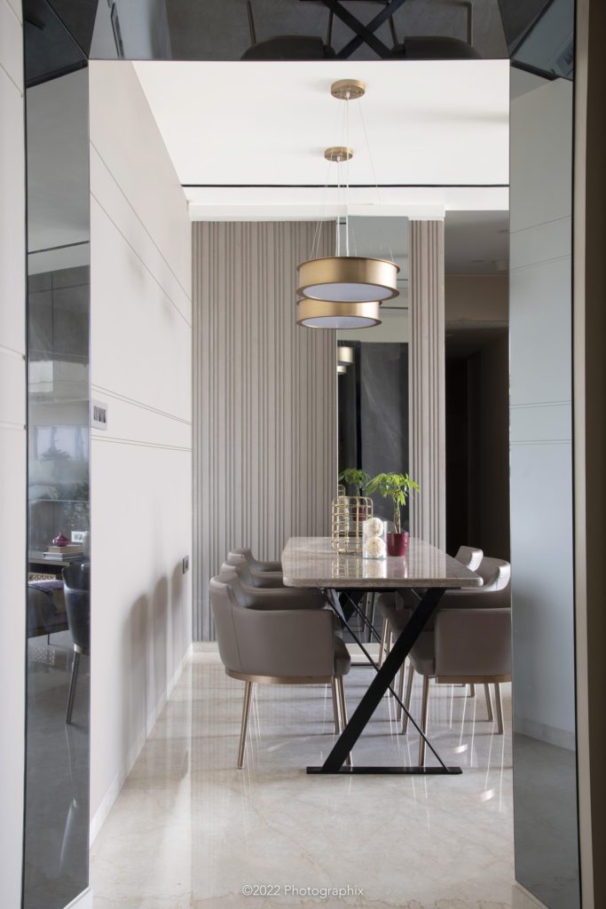
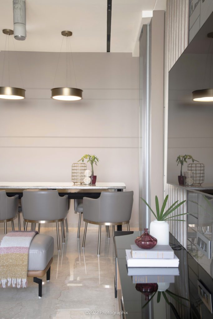
The soft glam, rich and lively living, and dining is a vibe, we’d like to bathe ourselves in!
The bar cum crockery unit was a highlight of the passage past the living room as it was placed very strategically between the kitchen, dining and living room. This made catering to all of these spaces and access extremely effortless.
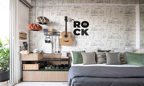
Moving forward, the passage leads us to the daughter’s room. We envisioned this space to be an eccentric, intricate, and balanced space. Our approach was to give a soft Boho feel that is balanced by the common neutral shades in other spaces of the house. We embodied that through subtle prints, English fusion lights, strong elements, vertical lines, and small patches of plants throughout.
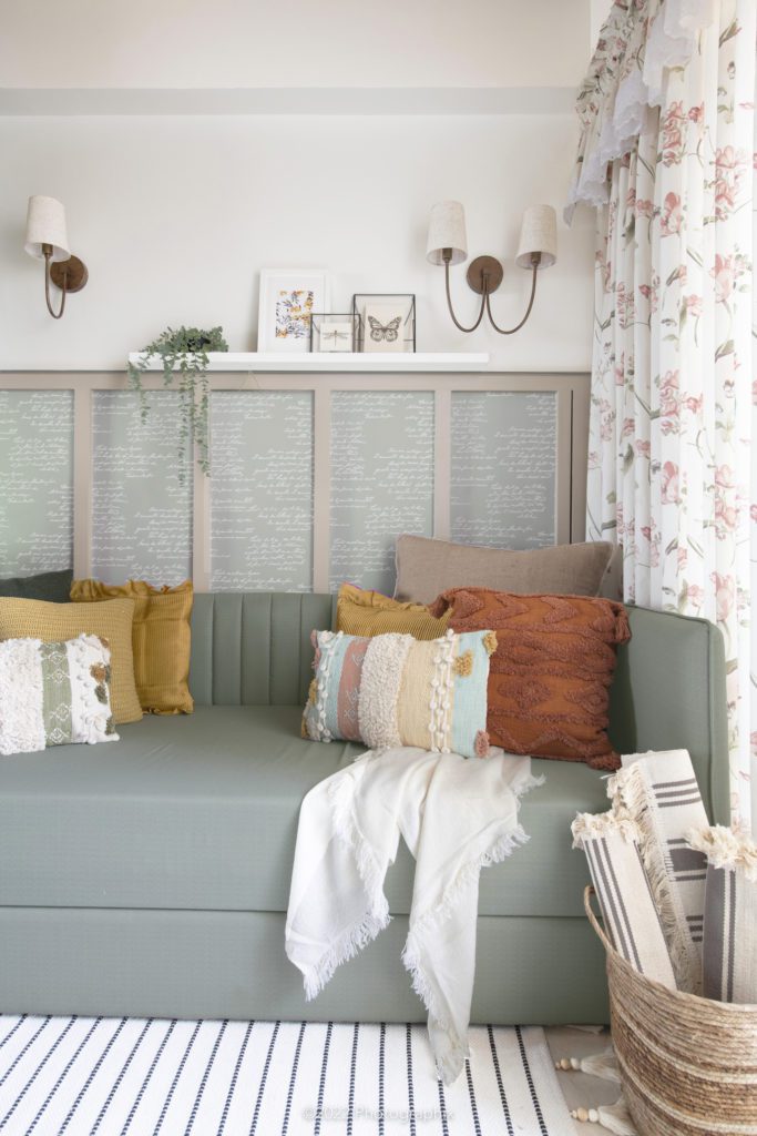
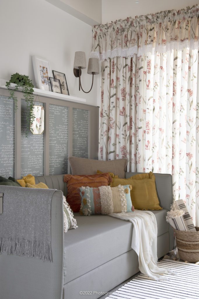
The color palette used in this room consisted of complimentary subtle shades and neutrals like sage green, mustard yellow, ochre, salmon, mint blue, white, beige, and grey. One design call that we made to make this tiny room look visually bigger is to clad the entrance partition completely with a mirror. A few more accessorizing details in this room to accentuate the design were floral prints on the curtains, botanical artworks on the wall, and cushion upholstery with different crochet designs.
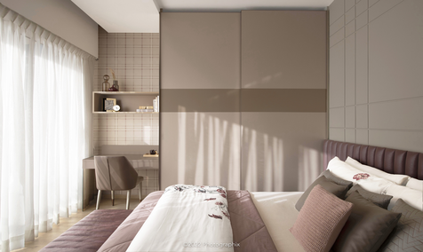
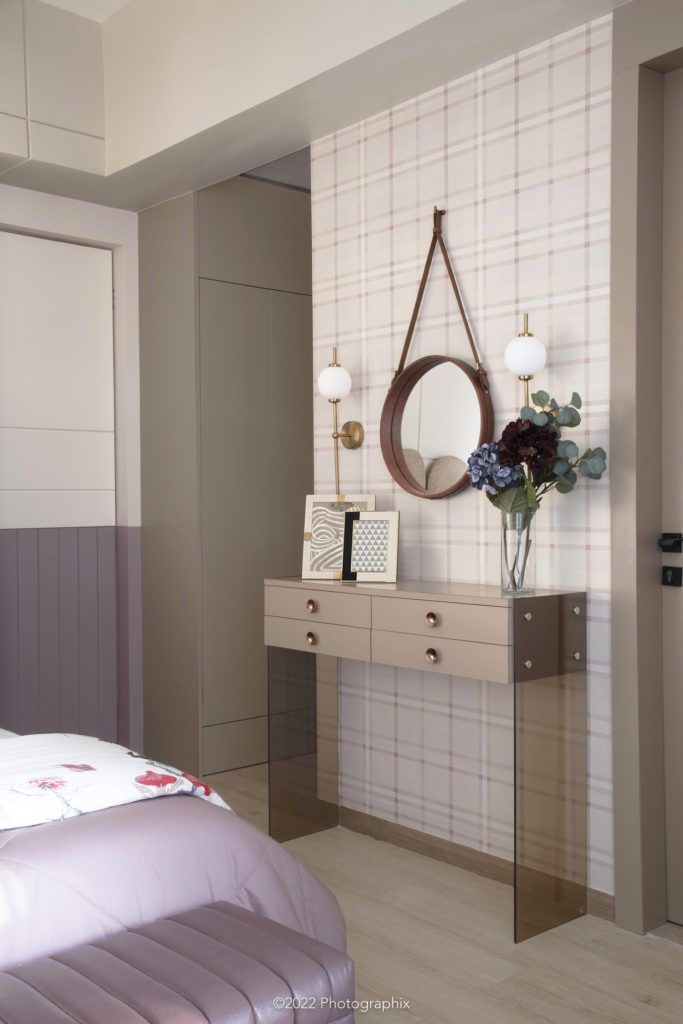
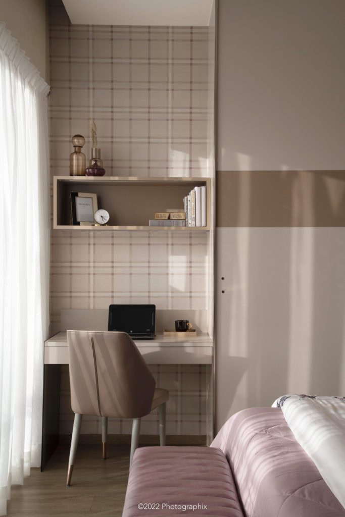
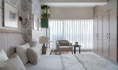
The passage leads next to the master room which is a class apart from the rest of the rooms. Mainly because of its favorable positioning that allows the golden glow to pass through its windows in the early evenings. This is the most uplifted well-lit and well-ventilated room in the house.
In this room, splashes of wine, pink, rose gold, and red are balanced by neutrals like off-white, white, beige, salmon, and taupe.

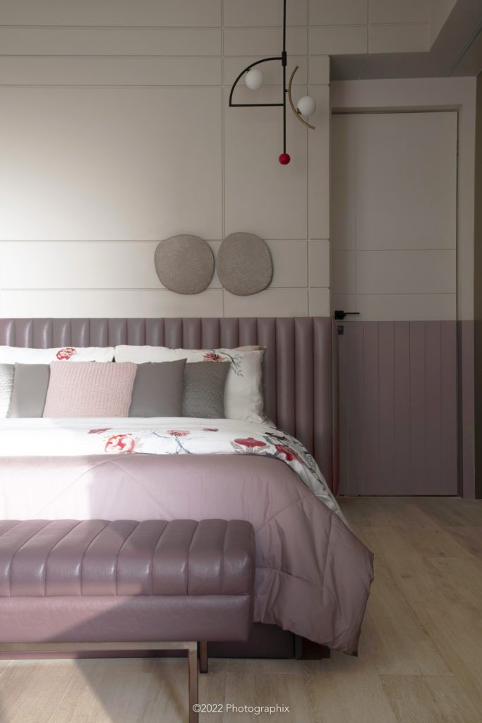
The terrazzo artwork with its irregular shape and the eclectic and sharp light piece with a stark purple gives this room a persona of its own. The stiffness of lines is broken by the soft padding in the bed back and ottoman.
This room’s design is also characterized by straight lines throughout in different forms and directions.
Additionally, the furniture pieces also take curved forms that go harmoniously with the rest of the room.
Chandra
Hello there, just became alert to your blog through Google, and found that it is
really informative. I am going to watch out for brussels.
I’ll be grateful if you continue this in future.
Lots of people will be benefited from your writing.
Cheers! Lista escape room
Larae
You actually make it seem so easy with your presentation however
I in finding this topic to be really something that I think
I would by no means understand. It seems too complicated and extremely large
for me. I’m looking forward on your subsequent post, I’ll try to
get the hold of it! Escape rooms hub